
EF ULTIMATE BREAK
Color Palette Rebrand
2022
EF Ultimate Break is the best way to travel for anyone 18–35.
After the challenges of the COVID-19 pandemic, Ultimate Break saw a huge surge in interest. People wanted to get out there and see the world.
In spring of 2022, the Ultimate Break design team embarked on a new project; redesigning our color palette. Before and during the pandemic, our color palette lacked systemization and a sense of solid branding. The values were predominantly pastel-focused, primarily utilizing blues and oranges. As the travel world witnessed a revival, the palette felt like it needed to be dusted off and rejuvenated. We had to climb to meet the feeling of this vibrant and exciting time.
Working alongside my Art Director and a fellow designer, we collaborated over a period of three months to develop the new palette. After hours of surveying, research, debating, and refinements, we curated a set of colors that satisfied brand needs, creative desires, and marketing objectives.
Before

The old palette had a surplus of very similar values which made it difficult to work with. With few saturated values, creating guidelines to abide by and grow from proved challenging.
After
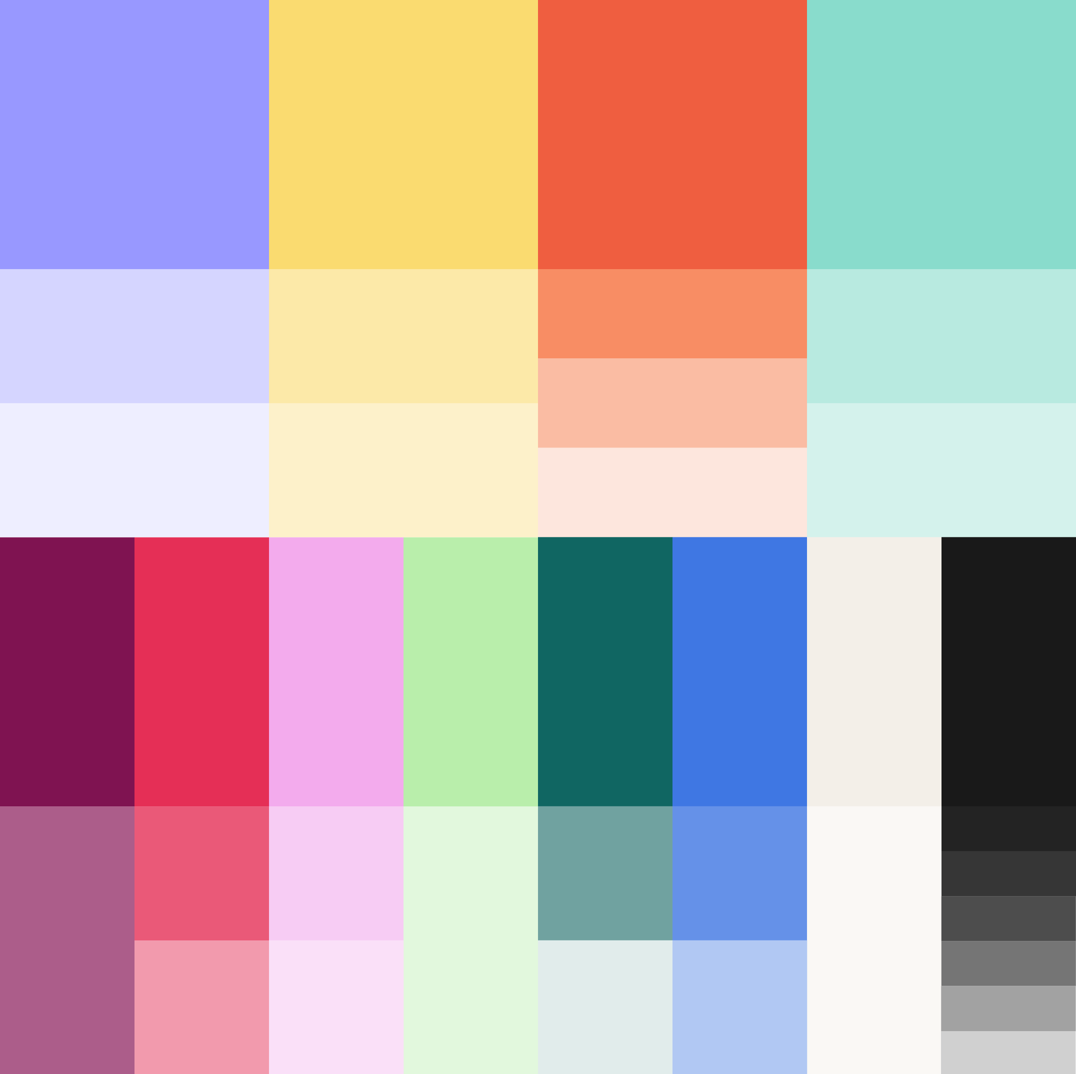
The new palette features a wider spectrum of colors which allows Ultimate Break to have a stronger visual presence and amplified voice. With fewer tint values, we are more intentional with how we use them which allows them to be used more frequently for better functionality.
Goals
Diversity
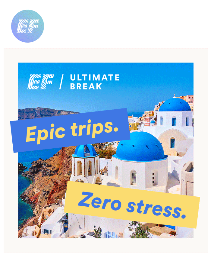
As a travel and destination company, we rely hugely on photography and how our colors react and cooperate with those photos. The old palette worked well with warm-tone locations, but we needed to meet the standard and diversity of all of the locations we travel to globally.
Impact
Our deep and wide array of values was intentionally chosen to match the energy and excitement that comes with the nuances and excitement of traveling. They are clearly identifiable to a Gen-Z and Millennial audience. The colors are loud when they need to be, but also considerate when they have to be.
Flexibility
Trends change, design changes, and how audiences perceive things changes. An important consideration we took was having the palette be expansive enough to adapt to directional changes and design trends. The color spectrum is wide enough to swap out a color or two should times call for it.


Guidelines
Since we do have what seems like so many more colors at our disposal compared to before, we needed to set some guidelines. We primarily rely on the “core four” colors which are Ube, Butter, Aperol, and Mojito. The secondary palette offers us flexibility and contrast in creating assets. Additionally, Tofu and Licorice provide us with solid neutrals.

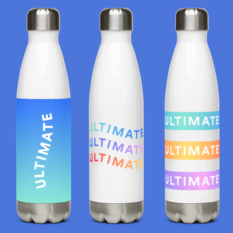
Gradients
Gradients were already a part of Ultimate Break’s color usage before we refreshed the palette. We wanted to still have them available to us, but only in ways that felt appropriate. With more color diversity, there is more opportunity for a larger quantity of gradient combinations. Through color tests, we narrowed our selection down to combinations that are both powerful and subtle. While the trend of gradients comes and goes, we now possess a set of them that add depth and texture to our design elements.


Welcome to show-stopping and eye-popping and jaw-dropping. As familiar as your ride or dies and as dreamy as your wildest daydreams. Trending on Tiktok? Duh. Roy G. Biv? Never heard of him. Bold and bright and day and night. Sophisticated when they have to be and wild when they want to be. Diverse enough to speak to everyone, and connected enough to bring people together. Inspired by cotton candy Santorini sunsets, lush Costa Rican rainforests, the neon steets of Tokyo, and far beyond.
These are the colors of EF Ultimate Break.
Project Team
Cameron Walsh (design)
Sarah Heingartner (art direction & design)
Kateri Gemperlein-Schirm (design)